There are a few reasons I want to make 3D models of mahjong tiles. The first is so that I can create a resource that game developers, animators, and other people can use as an asset in their project. The second is so I can make animations and videos for a YouTube series I want to create about how to play riichi mahjong. Since moving into a much smaller space several months ago, I don’t have as much control over light and sound, which makes filming difficult. My solution, then, is to do as much of the series in Blender as possible to keep quality consistent and minimize distractions in the video.
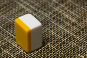
The first step is to secure reference material. For me, that would be my mahjong set. For others, that might be photo reference from still images online, videos of professional play, or gameplay from video games.
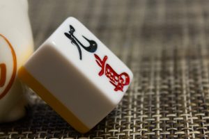
Before taking a detailed look at the tiles for this project, I had never noticed just how close the engraving on the face is to the edge. Similarly, this tile set does not have the dovetail joint that more traditional sets often have where the back of the tile is secured to the body, which is something I hadn’t paid attention to in the past.
You might be wondering what I’m going to do about the engraving on the tiles. Well, since the engraving doesn’t protrude out from the face of the tile, we can use a trick called bump mapping, where we apply a special texture to the object which gives the illusion of depth by creating highlights and shadows. Since we don’t need to create additional geometry, the tiles are easier and faster to make, render faster, and can be dropped into a game engine like Unity much easier.
After securing our resources, it’s time to figure out exactly how big the tiles are. Because Japanese mahjong tiles come in many subtly different sizes, it’s important to have reliable measurements. Because I have my own tiles as my reference, I can simply use a digital caliper to measure the size of my tiles down to 0.01 mm, so the models should be rather accurate.
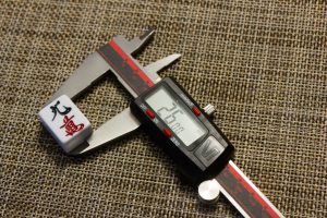
Height: 26.00 mm 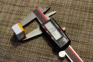
Width: 19.37 mm 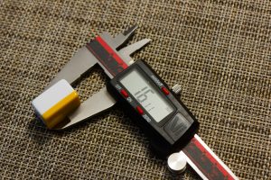
Depth: 16.11 mm
I also measured the depth of the engraving at 0.80 mm at its deepest point. Many other parts are much shallower, especially in the kanji at the bottom. We won’t have to worry about that until we get to creating the bump maps.
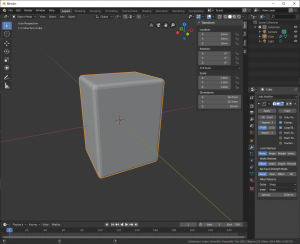
After opening Blender I deleted the default cube, set the units to millimeters, and changed the clipping distance to 1 mm so I can see the tile up close. Shift + A > Mesh > Cube to create the block that will eventually become the tile, N to open the transform panel, and enter the measurements of the tile. Blender is a ‘Z-up’ environment, which means the Z-axis is used for height, so we’ll enter 26 for Z under Dimensions. Whether we use X or Y for width or depth doesn’t matter too much, but we’ll use Y for depth, and X for width. I think this is the common way to do it (I’m not a professional modeler so I’m guessing a lot here), and I can hit 1 on the keypad to move the camera to a orthographic view of the tile face, which is handy.
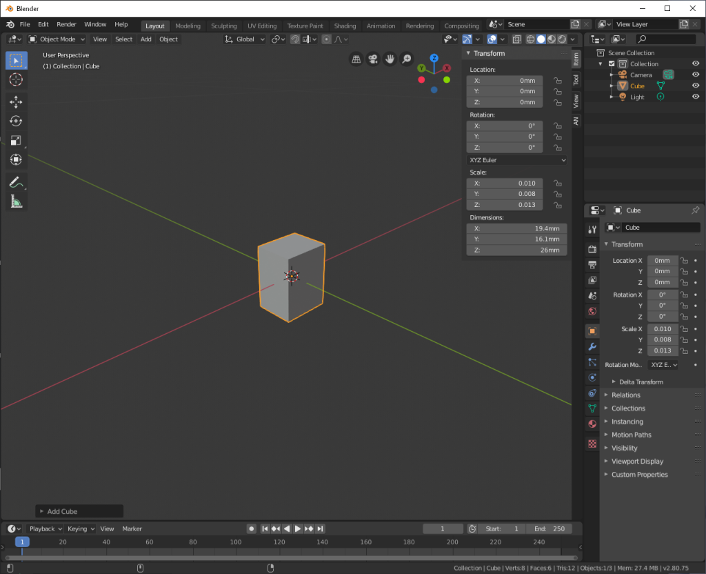
You’ll notice that Scale is 0.0xx. The default size for a cube is 2 meters on each side. Not having the scale set to 1.0 will cause us headaches in the future, so we can set the scale to the current dimensions with Control + A > Apply > Scale. You’ll also notice that it’s just an ugly grey block with sharp corners; doesn’t really look like a tile at all.
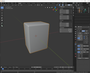
Let’s round off those sharp corners first. We’ll actually need one more measurement to make this process accurate, and that’s the size of the bevel. How do you measure that? Well, if you look at the image below, you can see the block we have with its hard corners, and the smooth bevel we want to give it in red. You’ll also notice that it’s part of a larger circle. The size of the bevel is the radius of the circle. Luckily, we don’t need to calculate the size of the circle, we just need to measure from the bottom of the bevel to the top of the tile, which will give us the radius, which we’ll enter into Blender.
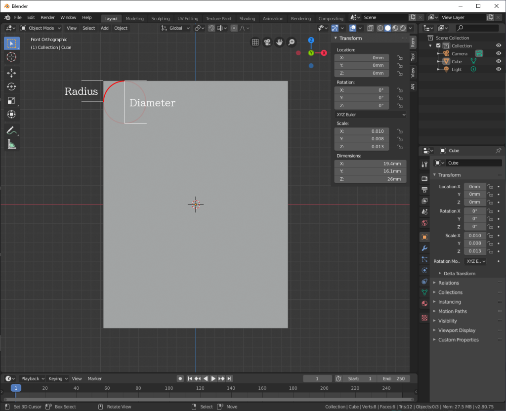
Determining exactly where the base of the bevel is can be pretty tricky, but with my digital calipers I got a measurement of 1.00 mm, which is a nice, round number, so I’ll go with that. If we create a Bevel Modifier and change the Width to 1 mm (the radius we just measured) we should see an instant result. From here, we can also change the Segments value (how much extra detail the Bevel modifier adds to our tile) if we want a smoother shape, the Profile (changes the shape of the bevel), and a few other things which I’m not entirely educated on. Because we can always change these values later, let’s leave Segments at 3 and Profile at 0.50.
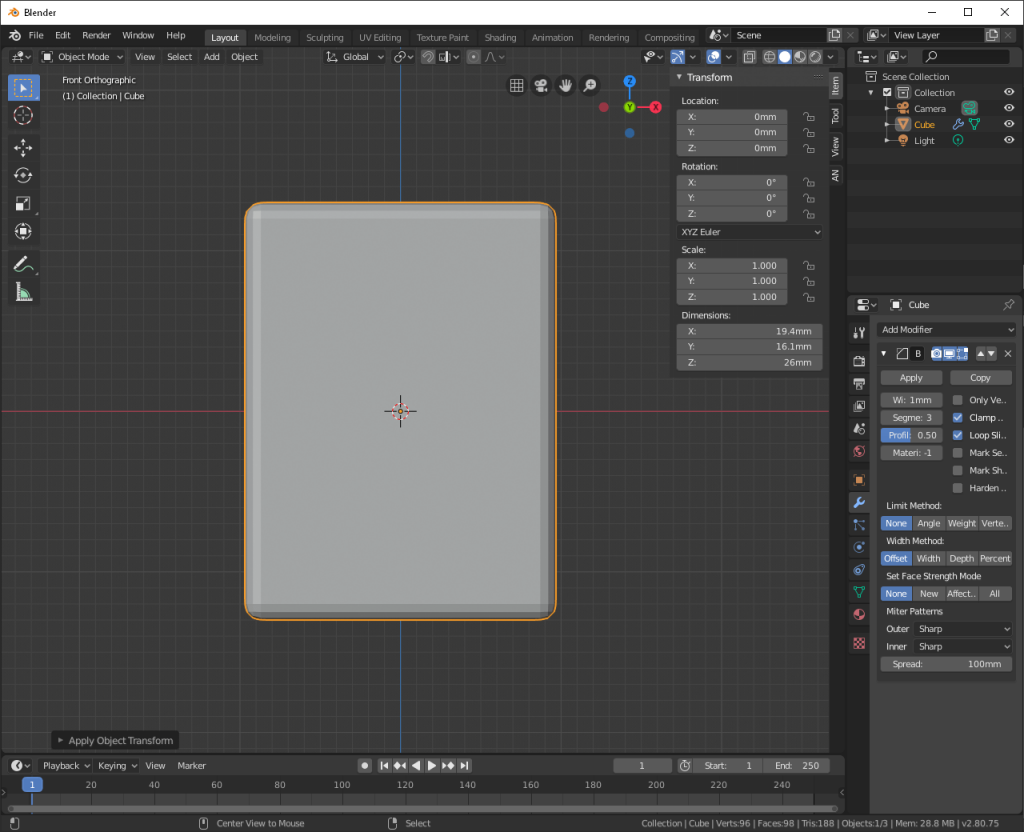
Okay, okay, I can hear you; we’ll make it smooth, but I don’t want to give it any additional geometry. To accomplish this, we go to Object > Shade Smooth. This will update how the edges of the geometry are treated by the rendering engine. It’s not actually smoothing out the shape, it just looks that way, which is good enough for now. If we need to add real smooth edges we can always change the Segment value in the Bevel modifier.
So we have a tile, but it’s still grey and ugly. Let’s put make it shiny and white. To do that, we need to give it a material. The default material will honestly work fine, since it’s white already, we just need to make it shiny. To do that, we’ll turn down the roughness to .25. If you look closely at a real tile you’ll notice there’s a very slight grain in the plastic (or maybe that’s just my set), but overall it’s still shiny. We’re lowering the roughness value to make it look shiny and new, but we’ll want to add this graininess back in later.
If you’re following along, you’ll probably notice that the tile hasn’t changed at all. ヽ ( ꒪д꒪ )ノ So far we’ve been working with the solid shader. To see our changes in real-time we need to switch to the look dev shader (it’s all those circles in the top-right of the viewport).
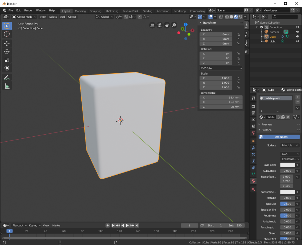
Alright, cool, we’re almost there. If we just wanted a haku from the all-white set Ichikawaya sells, we’d be done. Next, let’s add the back. We’re going to need another measurement; this time to see how thick the back of the tile is. It’s a bit difficult to measure, on account of the bevel, but I was getting around 4 mm. To apply a new texture to only the back of the tile, we’ll need to create a loop cut around the tile. Once that’s done, we can create a new texture (color) and assign it to a specific part of the tile.
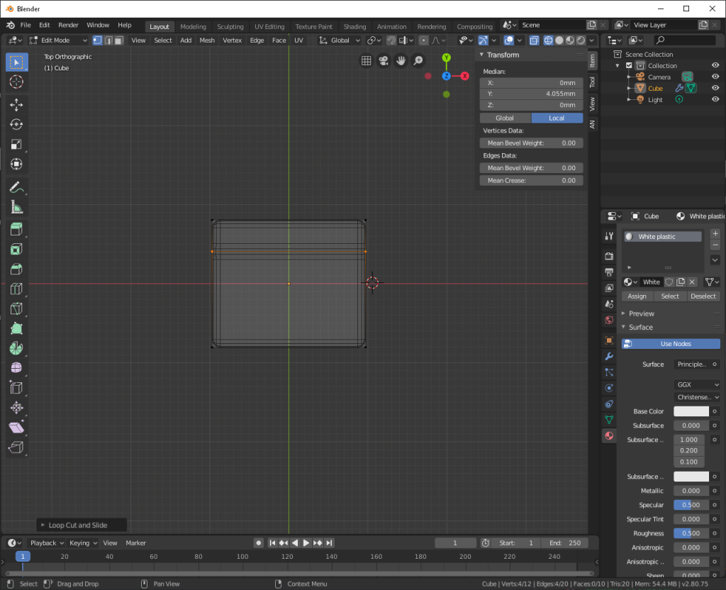
I prefer to do this in wireframe from a top-down orthographic view. You can get here by pressing 7 on your keypad. Wireframe view is the first of the four circles where we changed from the solid to look dev shader. Press tab to enter edit mode, then press control + R to start a loop cut. When you hover over the left or right side of the tile you’ll see a line bisecting it. Make sure the line is horizontal, because we want to cut across the tile lengthwise, and click your left mouse button. If you move your mouse button around, you’ll notice the line moves with it. For now, click the right mouse button to set the cut back to the center where it started. There are a few ways we can set the line to be exactly where we want. In the Transform box, which should still be open (press N if it isn’t), you’ll see that Y under Median is 0 mm. This is the location of the cut. We’ll do a little bit of math to determine where this should be. We know the thickness of our tile is 16.11 mm, and since we’re right in the middle, we know the back of the tile is 16.11 mm / 2, or 8.055 mm away from the center. We want our cut to be 4 mm from the back, so 8.055 – 4 = 4.055 mm. If we enter this in to the Y value, it slides right into place.
Let’s tab out of edit mode and back into object mode. There’s an awful lot of geometry because of the bevel modifier, so let’s hide its effects for now by going back into the Modifier tab and clicking the icon at the top that looks like a computer monitor. We’re now back to our ugly, sharp block, but that’s exactly what we want. If we hop back to the Material tab and add a new material slot, we can then create a new material (color) for the back. Click on +New and give it the same .25 roughness so it matches the white plastic. This can be any color you want, but I’m going with hex value #e9b501 that I got from the photos I took of my tiles.
Tab back into edit mode and click the Face Select option at the top-left, near where it says ‘Edit Mode’. All the segments that make up the tile (individually these are called faces, but if you come from a gaming background, you can think of these as polygons). While holding down the shift key, click on each of the faces that make up the back of the tile. If you hold down the middle mouse button and move the mouse around, your view of the tile will rotate around the center of it. This might help you get a better look at what you’re doing. With the back of the tile selected, click the Assign button in the Material tab.
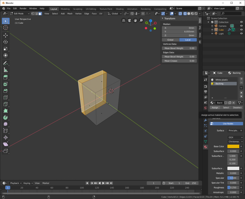
Tab back into Object Mode and change the shading type back to look dev. The tile looks kind of ugly, but this is because we have smooth shading on something covered in hard edges. If we go back into the Modifiers tab and turn the Bevel modifier back on, it looks much better.
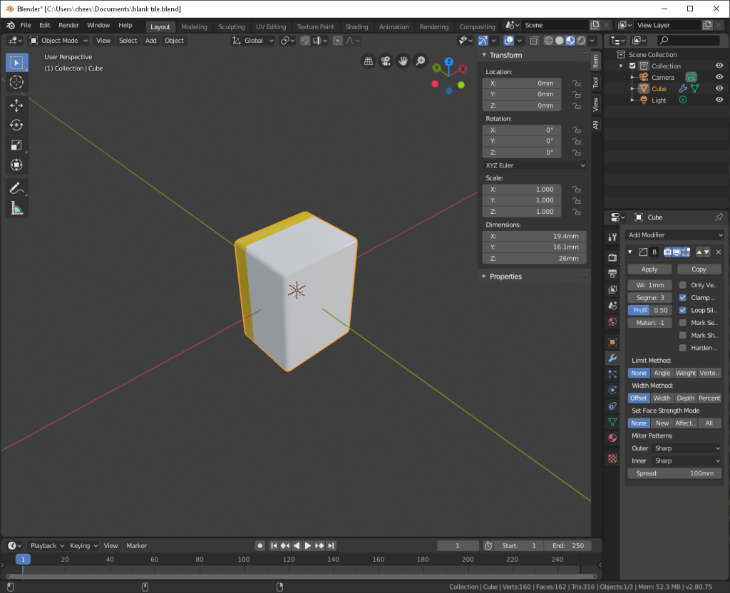
Taking a look at the tile, we can see that the backing looks a little broken on the corners. This is because of the Bevel modifier. For now, we’ll just increase the number of segments to 4 and move on.
Okay, now it’s time to start engraving the tile. To do that, we need to create a texture map, which will give us something to draw on that Blender can then re-apply to the model. We need to tell Blender where on the model we want it to cut the model apart, because a texture is a flat image and we need to fold that flat image over a three-dimensional object, not unlike trying to wrap a Christmas present. Let’s turn off the Bevel modifier again and tab into Edit Mode. Click on the Edge Select button, right next to the Face Select button. We need to start by deselecting everything, which for me is double-tapping A, but for others might be alt+ A. While holding shift, click the edges around the face of the tile.
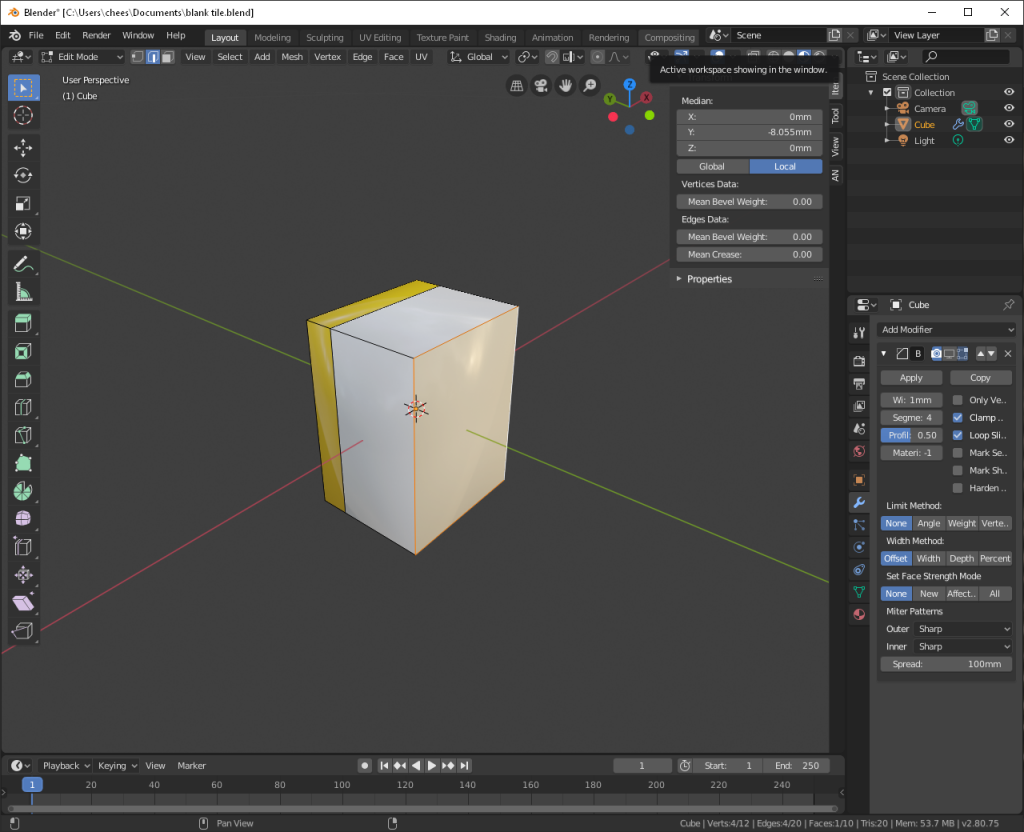
This is a big different than how we would normally unwrap a box, but because we really only care about the face, we’re going to cut it out separate from the rest of the tile. Press control + E to open the Edge menu, and select Mark Seam. The selected area should now be extra bold. If we deselect everything again, you’ll notice the area still has an outline. This is so you can know where you’ve already marked the model to be split. We’ll do the same thing along the sides, but not along the back.
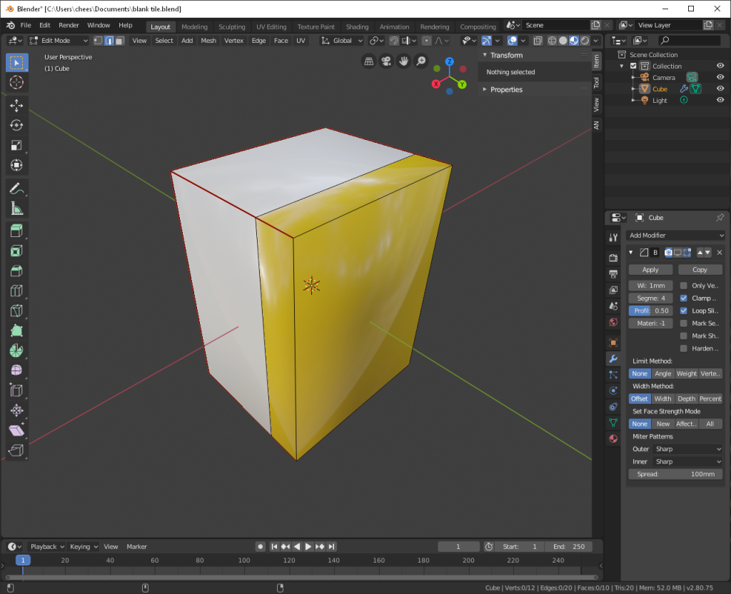
Press A to select the whole model, then U > Unwrap. You shouldn’t see anything change, but if you go to the viewport at the bottom of the screen (it should currently be set to Playback), drag it up, and change it to UV Editor, you should see all of the edges of the model neatly unwrapped and laying down flat.
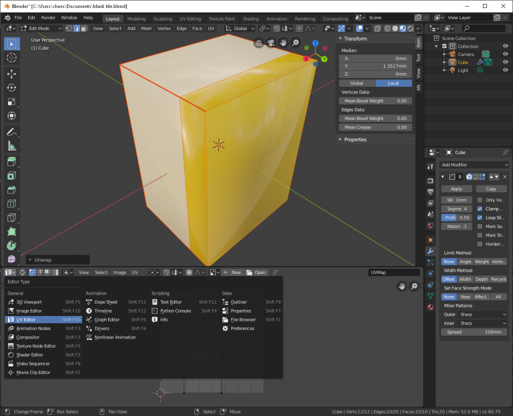
If you want to play around a little bit, switch from the edge selection to the face selection, then click on different parts of the tile. You should see it appear in the UV Editor. Select everything again with A, and in the UV Editor window, go to UV > Export UV Layout. Select a destination for the image to be saved, then change the size to be 4096 for both values.
Now we’re starting to get into the domain that I have only some experience in. I’m sure there are much more time and resource efficient ways to complete this project, but I’m just gonna figure it out as I go.
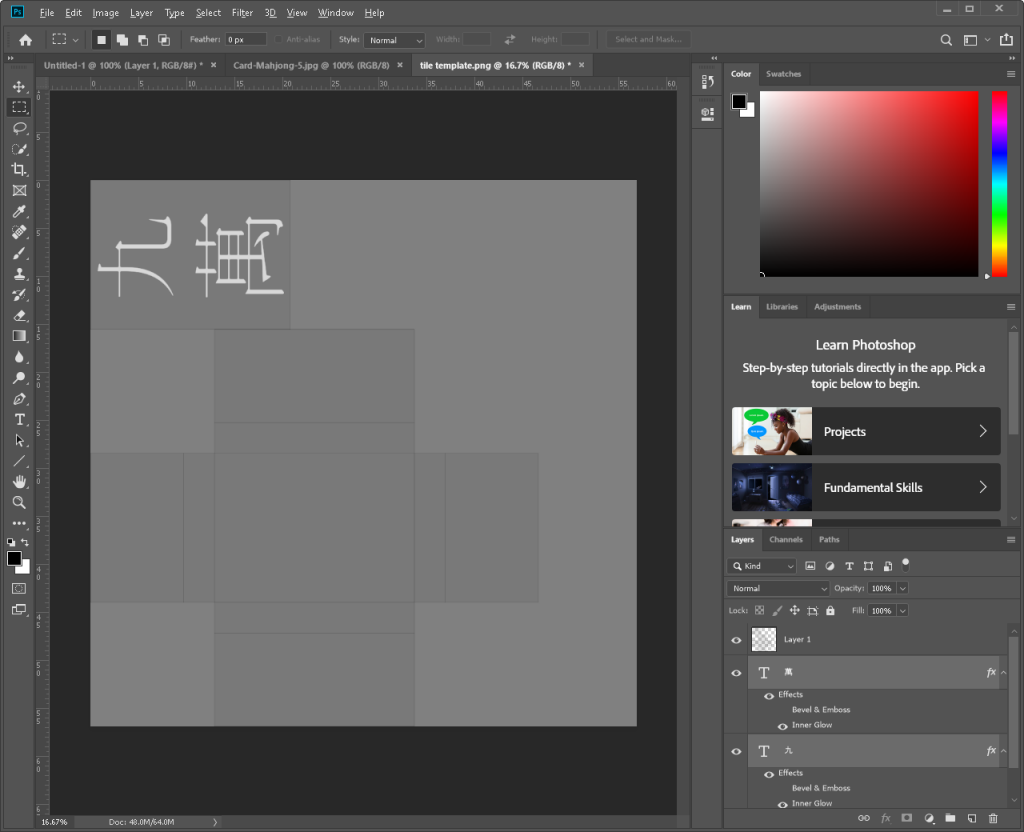
Open the PNG tile you just exported in your image editing suite of choice. For me, that’s Photoshop. Create a new layer under the image we just opened and fill it with 50% grey. For bump maps, 50% grey is no change, white is digging into the object, and black is protruding out from it. Using the image as a template, add whatever text and characters to the design. The orientation may take some trial and error (though more experienced users would be able to determine this ahead of time), but when you’re done with your design, hide the layer of the original image (if you don’t, you’ll end up with outlines on your model), and save it as a PNG.
Back in Blender, go to the Material tab and select the material used for the white plastic. In the bottom viewport, change it to the Shader Editor view. There should be a Principled BSDF node connected to the Material Output node. Right click on the Principled BSDF node to select it, then click and drag it away so we can insert some nodes between it and the Material Output node.
In a blank area, press shift + A to open the Add menu, then Texture > Image Texture. Click the Open Image button (it looks like a folder) and select the PNG file you exported from your image editor. In another blank area, shift + A, then Vector > Bump. Click and drag the yellow dot next to Color inside the Image Texture node and connect it to the purple dot next to Normal on the left side of the Bump node. This is taking the color data (it’s black and white, but we’re looking for the values in the image, not in it’s transparency [alpha] data) and plugging it into the Bump node as a type of data source. Next, we want to connect the purple dot next to Normal on the right side of the Bump node, and connect that do Displacement on the Material Output node.
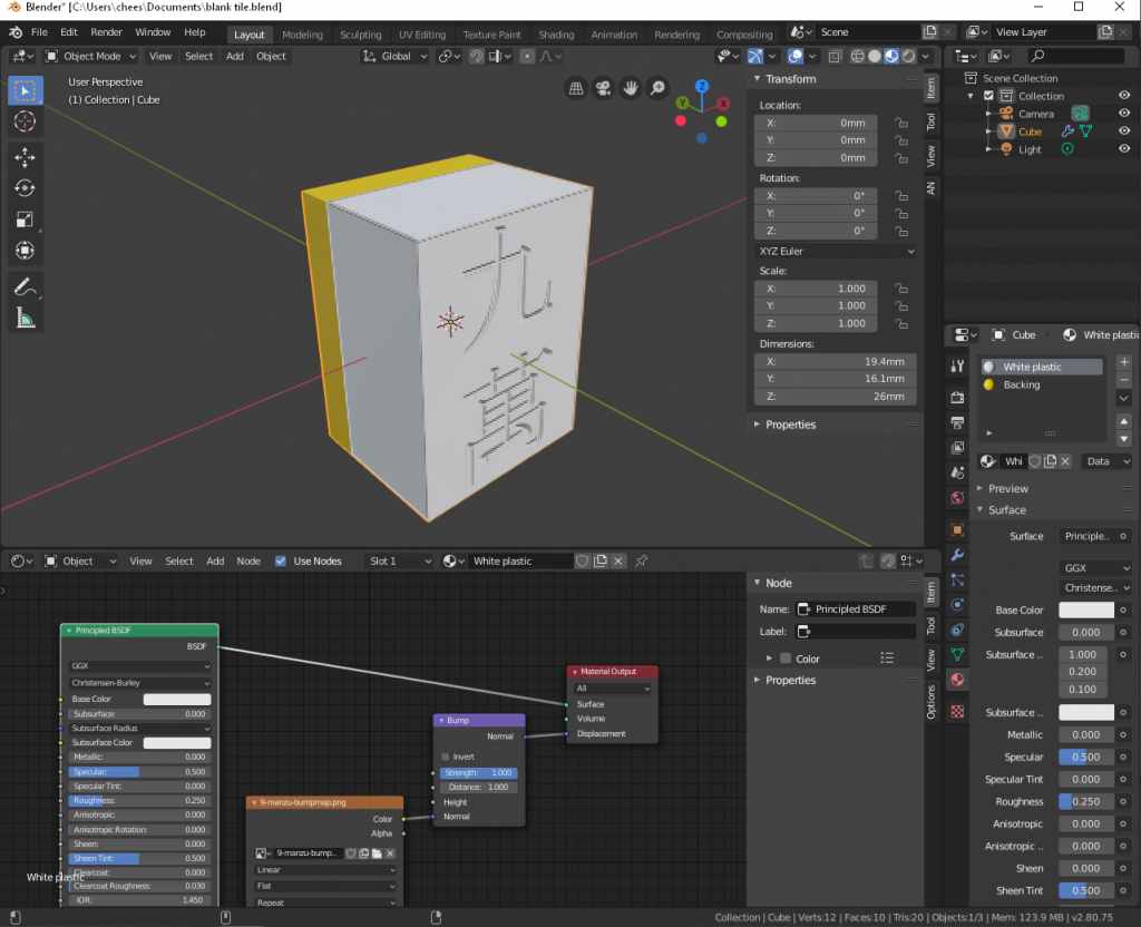
It worked, but it looks kind’a crappy. This is because we’re looking at a low resolution version for quick and efficient editing. I’m sure there’s a simple setting somewhere to increase the resolution here, but because I don’t want to figure out where that is right now, I’m just going to switch over to a different rendering engine that gives us better results at the expense of longer render times.
Go to the Render tab (it looks like the back of a camera), and change the rendering engine to Cycles. Change the viewport shading (those circles at the top-right) to rendered. We also want a nice environment to light our model. We could manually add light sources, but for a quick and natural effect, I’m using an environmental texture called an HDRI, which is a 360 image that projects light into the scene in an even, natural way. I’m using this one. You can download any size you like, but I went with the 4K version since there’s no tangible effect with higher resolution versions for this project. Once that’s downloaded and placed where you want it to live, go to the World tap and, under Surface, click the circle next to Color and choose Environmental Texture. Click the Open Image button and select your HDRI file. Let’s also turn on the Bevel modifier again and see what we get.
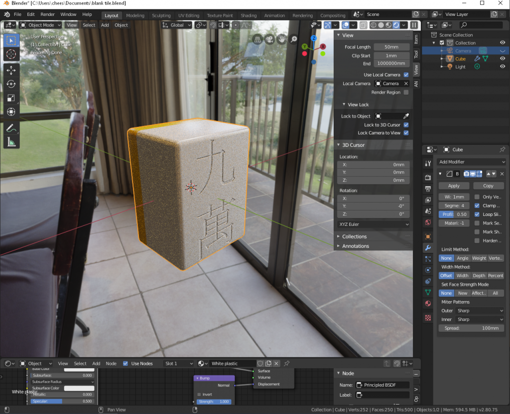
Not too shabby! We still need to add the paint inside the engraving, as well as make the engraving depth match the tile a bit more. The paint is simple, though. We have our image editor open still, so we’ll hop over there and change the image to have a white background, change the 九 to black, and the 萬 to red, and export as a new image. Back in Blender, we add a new Image Texture node, just like when we created the engraving, but this time we select the new, colored texture we just created, and punch that into the Base Color input in the Principled BSDF node. The image should instantly update to reflect the new texture. Because we have a different material controlling the back, we don’t have to worry about coloring it in the texture.
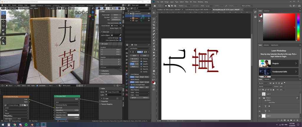
So now we have two small issues. One is that the font I used is way too thin, so I changed out the font I had been using with a thicker one. Two is the depth of the engraving. The thicker font helped, but I think I’m running into a limitation of using bump maps. If I wanted to really control how deep the engraving is I would need to add a lot of geometry and apply a different technique to change the surface of the tile, rather than faking it with artificial highlights and shadows.
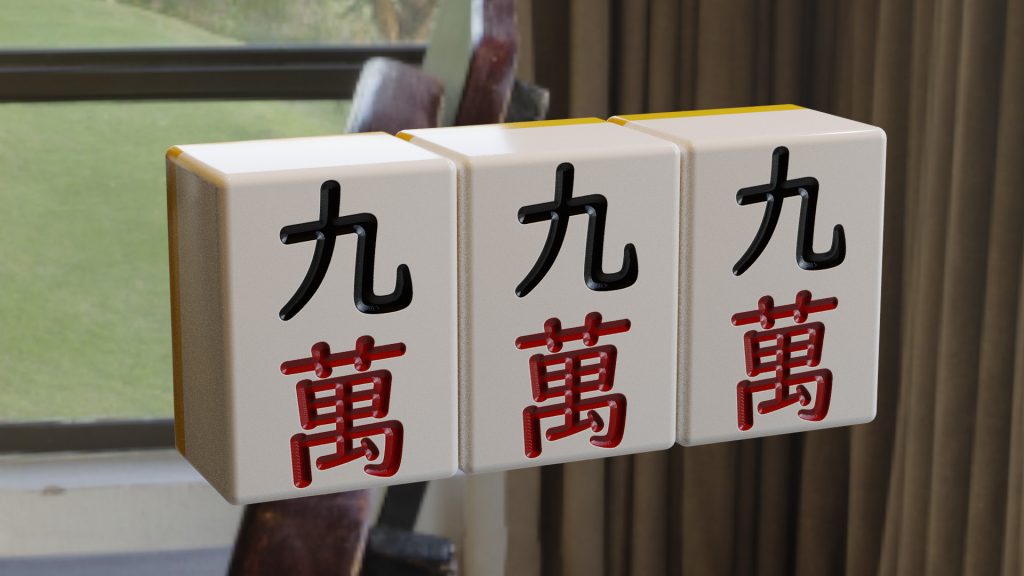
So this is the final result, at least for now. I might make a few changes to this workflow, like making more efficient use of the UV map, but overall I think this has set me up quite well for hamming out all the other 33 types of tiles. Once I’ve finished them all I’ll upload them to the website so anyone can grab use them.
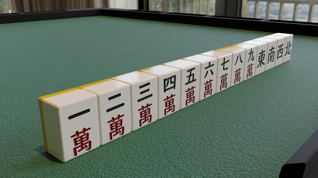
Update: I had some extra time later in the evening, so I finished the manzu set as well as the winds, and even recreated my JunkMat. I still have some texture work to address on the plastic frame of the mat and the mat itself, but overall it’s not too bad. You can see in the edges of the 1 manzu that I turned off smooth shading. I’m going to keep experimenting but for now I need to figure out what I’m going to do about designing the pinzu and souzu tiles.
Hey man, did you ever finish these tiles? I want to use them for a little personal project, they look great.
HI I have a problem when it comes to colouring my shape like it won’t work… and when I cut it it doesn’t change the color…
im using blender 4.3.2 version.. I really do want to make these tiles too..